Behind the Serious Game Model

In a previous post, we shared, in a very general way, how and with what tools we had made in Ikasplay the design and development of the Susmile project’s Serious Game. We find now interesting to focus on the mathematical model, since it is what has aroused the most interest.
Where do you start?
Like everything, from the beginning 😉… and on paper. It is very important to make the first sketches of the model on paper, to identify all the variables that may have an impact on the system that we want to simulate.
For example, in the case of Susmile, the main variables are the “Number of Orders” and “Pollution“, and from here other variables have to be added: “Drivers” who distribute the orders in different types of “Vehicles“, the vehicles have “Maximum load” and “Speed average” depending on the “Zone Type “, which in turn has “Traffic” depending on the time, “Number of customers” scattered in a given “Area” …
These variables give an evolution of the system.
OK, we have the variables, and then?
Once the list of variables has been obtained, we must start looking for the relationships between each of them, thus generating the so-called Causal Diagrams that collect key elements of the System and the relationships between them.
It is convenient to mark with a sign (+) or (-) the relationships that join the different variables, to mark if they have between them a positive relationship (if one increases the other also) or negative (if one decreases the other increases and vice versa).
We share in the following image one of the first sketches of the mathematical model. With this, the whole model began to be built:
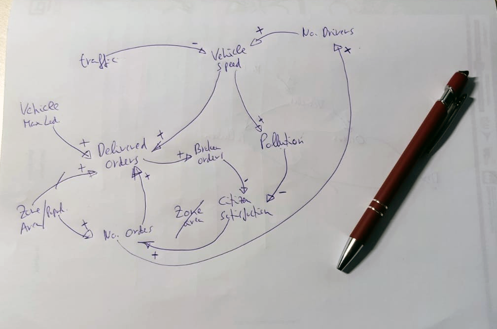
In short, with this type of diagrams we have a set of elements that are related to the System, which allow us, to explain the observed behaviour. All this elements forms the System.
Understood, but when do you go digital?
Once the variables and relationships that build the system are clear, we move from Causal Diagrams to Forrester Diagrams (also known as Flow Diagrams). This diagram defines an evolution that allows calculations to be carried out from qualitative to quantitative values. They can be defined as a translation of the Causal Diagram into a terminology that allows the writing of the equations on the computer to validate the model.
And in this way, and after many versions, we arrive at the final version of the model, which can be seen in the following image.

As you will see, the number of variables and relationships between them has increased considerably, to seek maximum precision of the system. For example, if we zoom one of the areas of the diagram:
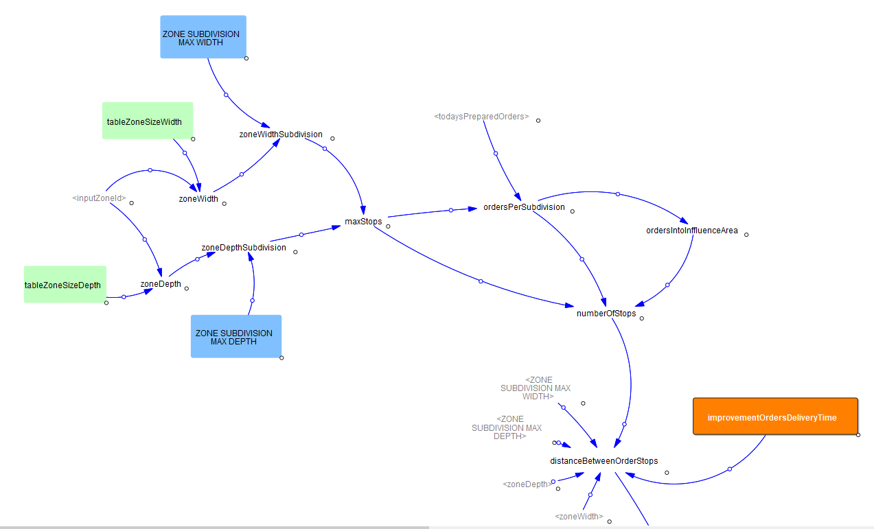
We can see in the image the part of the model that calculates the distance between orders, a very important fact to be able to estimate the delivery time of orders.
Do models live on diagrams alone?
No. Apart from these diagrams, at Ikasplay we also use office tools such as Excel, which help us quantify and test data before putting it into the Forrester model.
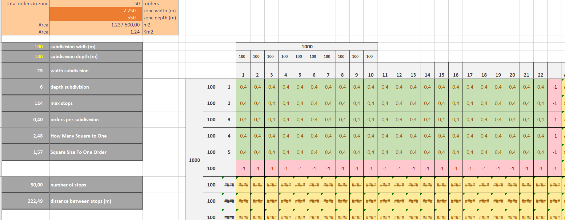
In this image we work visually using Excel, the distribution of orders on a specific area, to here get the mathematical formula that best describes this situation.
Bufff… Too many cells… Can you show us anything more fun?
Of course, we simply wanted to show a brushstroke to know what is behind the serious game in Susmile, the fun part is in playing it. Therefore, we leave you in this link access to the V1 of the Susmile Serious Game:
https://mooc.susmile.eu/sg/
At the moment the consortium that participates in the project is testing it together with the target audience, in order to have feedback and include improvements for the final version.